0 → 1
Launchpad
live
Every visible property comes from a step, and every element exists exactly once. Everything the pages are built from lives here.
No matching example in this view. Clear the search or select another category.
Each category loads its own examples. Source contracts sit beneath each preview; native hover and keyboard focus can be tested directly.
Radix scales with twelve steps: 1–2 backgrounds, 3–5 surfaces, 6–8 borders, 9–10 solids, 11–12 text.
Read values from src/styles/tokens; primitives are only for foundation displays, components consume semantic roles.
Primary source: src/components/ds/foundations/ColorScales.astro
Variants: light / dark
States: default
<ColorScales locale={locale} />Read values from src/styles/tokens; primitives are only for foundation displays, components consume semantic roles.
Primary source: src/components/ds/foundations/SpacingScale.astro
Variants: light / dark
States: default
<SpacingScale locale={locale} />Read values from src/styles/tokens; primitives are only for foundation displays, components consume semantic roles.
Primary source: src/components/ds/foundations/RadiusScale.astro
Variants: light / dark
States: default
<RadiusScale locale={locale} />Read values from src/styles/tokens; primitives are only for foundation displays, components consume semantic roles.
Primary source: src/components/ds/foundations/ShadowScale.astro
Variants: light / dark
States: default
<ShadowScale locale={locale} />Clear systems for complex products
Clear systems for complex products
Clear systems for complex products
Clear systems for complex products
Clear systems for complex products
Clear systems for complex products
Clear systems for complex products
Clear systems for complex products
Clear systems for complex products
Clear systems for complex products
Read values from src/styles/tokens; primitives are only for foundation displays, components consume semantic roles.
Primary source: src/components/ds/foundations/TypeScale.astro
Variants: light / dark
States: default
<TypeScale locale={locale} />Input
Use Input for native text/search fields. Always connect a visible label; errors use aria-invalid and aria-describedby.
Primary source: src/components/ui/input.tsx
Variants: size: sm | md · native input props except numeric size
States: empty · filled · focus-visible · disabled · readOnly · aria-invalid + aria-describedby
<label for="search">Search work</label>
<Input id="search" type="search" size="md" />Card
Cards hold one unit of content and lift off the page by one shadow step.
Reuse this composition from its source and demo. Keep its existing semantic structure and locale/data contracts.
Primary source: src/components/ui/card.tsx
src/components/ui/badge.tsx
src/components/ui/separator.tsx
States: default · keyboard focus where interactive · light / dark · reduced motion
<Card className="max-w-text">
    <CardHeader><CardTitle>{t(locale, 'ds.cardTitle')}</CardTitle><CardDescription>{t(locale, 'ds.cardBody')}</CardDescription></CardHeader>
    <Separator />
    <div class="flex gap-2"><Badge tone="brand" dot>{t(locale, 'flag.tag')}</Badge></div>
  </Card>
Table
| Figure | What |
|---|---|
| 0 → 1 | One entry point for every zvoove product, from the first shell prototype to shipping with the zvoove One bundles. |
| 4 → 14 | Grew the Container xChange design team as Design Co-Lead. |
| Seven figures | Outstanding customer receivables brought back, a joint initiative in finance. |
| Since 2017 | My own design systems, from car2go and SHARE NOW to Compass. |
Reuse this composition from its source and demo. Keep its existing semantic structure and locale/data contracts.
Primary source: src/components/ui/table.tsx
States: default · keyboard focus where interactive · light / dark · reduced motion
<div class="overflow-hidden rounded-card bg-panel shadow-lift">
    <Table>
      <TableHeader><TableRow><TableHead>{locale === 'de' ? 'Kennzahl' : 'Figure'}</TableHead><TableHead>{locale === 'de' ? 'Was' : 'What'}</TableHead></TableRow></TableHeader>
      <TableBody>
        {proof.map((n) => <TableRow><TableCell className="text-lg font-medium text-ink tabular-nums">{t(locale, `proof.${n}.v`)}</TableCell><TableCell>{t(locale, `proof.${n}.t`)}</TableCell></TableRow>)}
      </TableBody>
    </Table>
  </div>
Dialog, menu, tooltip
Use the existing Radix dialog/menu/tooltip wrappers. Dialogs require an accessible title and focus return; tooltips never carry essential content alone.
Primary source: src/components/ds/PrimitiveDemos.astro
src/components/islands/DsDialogDemo.tsx
src/components/islands/DsTooltipDemo.tsx
src/components/islands/PanelMenu.tsx
src/components/islands/PreRead.tsx
States: default · keyboard focus where interactive · light / dark · reduced motion
<div class="flex flex-wrap items-center gap-3">
    <DsDialogDemo client:visible open={t(locale, 'ds.dialogOpen')} title={t(locale, 'ds.dialogTitle')} body={t(locale, 'ds.dialogBody')} close={t(locale, 'ds.close')} />
    <PanelMenu client:visible label={t(locale, 'ds.menuLabel')} items={[{label: t(locale, 'ds.menuAll'), href: '/work/'}, {label: t(locale, 'ds.menuCv'), href: t(locale, 'nav.cvHref')}]} />
    <DsTooltipDemo client:visible trigger={t(locale, 'ds.tooltipTrigger')} text={t(locale, 'ds.tooltip')} />
    <PreRead client:visible trigger={t(locale, 'preread.open')} title={t(locale, 'preread.title')} intro={t(locale, 'preread.intro')} items={[t(locale, 'preread.1'), t(locale, 'preread.2'), t(locale, 'preread.3')]} closeLabel={t(locale, 'ds.close')} />
  </div>
SegmentSwitcher
Use links for navigation and buttons for in-page choices. Exactly one current/pressed item.
Primary source: src/components/SegmentSwitcher.astro
Variants: mode: links | buttons
States: default · keyboard focus where interactive · light / dark · reduced motion
<div class="flex flex-wrap items-center gap-6">
    <SegmentSwitcher name="lang-demo" mode="links" label={t(locale, 'lang.label')} items={[{value: 'de', label: 'DE', lang: 'de', href: localePath('de', '/design-system/'), current: locale === 'de'}, {value: 'en', label: 'EN', lang: 'en', href: localePath('en', '/design-system/'), current: locale === 'en'}]} />
    <SegmentSwitcher name="theme-demo" mode="buttons" label={t(locale, 'switch.theme')} items={[{value: 'system', label: t(locale, 'theme.system'), current: true}, {value: 'light', label: t(locale, 'theme.light')}, {value: 'dark', label: t(locale, 'theme.dark')}]} />
</div>Shortcuts
Chapters CPre-read KRead the case RStory S / W
Reuse this composition from its source and demo. Keep its existing semantic structure and locale/data contracts.
Primary source: src/components/Keycap.astro
States: default · keyboard focus where interactive · light / dark · reduced motion
<div class="flex flex-col gap-4"><div class="flex items-center gap-2 text-xs text-ink-muted"><Keycap>C</Keycap><Keycap>K</Keycap><Keycap>S</Keycap><Keycap>W</Keycap><Keycap>L</Keycap><Keycap>T</Keycap><Keycap title="Enter">↵</Keycap><Keycap>Esc</Keycap><Keycap>?</Keycap></div><p class="flex flex-wrap items-center gap-6 text-xs text-ink-muted"><span class="inline-flex items-center gap-2">{t(locale,'case.chapters')} <Keycap>C</Keycap></span><span class="inline-flex items-center gap-2">{t(locale,'case.preRead')} <Keycap>K</Keycap></span><span class="inline-flex items-center gap-2">{t(locale,'case.readCase')} <Keycap>R</Keycap></span><span class="inline-flex items-center gap-2">Story <Keycap>S</Keycap> / <Keycap>W</Keycap></span></p></div>Switch · Radix
Use the existing Radix Switch with a visible label and controlled on/off semantics.
Primary source: src/components/ui/switch.tsx
src/components/islands/SwitchDemo.tsx
Variants: checked | unchecked · disabled
States: default · keyboard focus where interactive · light / dark · reduced motion
<SwitchDemo client:load label={t(locale,'keys.enabled')}/>KeyboardHelp
Reuse this composition from its source and demo. Keep its existing semantic structure and locale/data contracts.
Primary source: src/components/islands/KeyboardHelp.tsx
src/components/Keycap.astro
States: default · keyboard focus where interactive · light / dark · reduced motion
<button hidden type="button" data-keyboard-help aria-haspopup="dialog" aria-expanded="false" aria-keyshortcuts="?" class="inline-flex min-h-8 items-center gap-2 rounded-control border border-line px-3 text-sm hover:bg-sunken focus-visible:outline-2 focus-visible:outline-ring"><Keycap>?</Keycap>{t(locale,'island.label')}</button>
  <KeyboardHelp client:load title={t(locale,'island.label')} close={t(locale,'case.close')} enabled={t(locale,'keys.enabled')} hint={t(locale,'keys.hint')} native={t(locale,'keys.native')} sections={{reading:t(locale,'keys.reading'),page:t(locale,'keys.page'),focus:t(locale,'keys.focus')}} shortcuts={[{key:'?',label:t(locale,'keys.help')},{key:'L',label:t(locale,'island.lang')},{key:'T',label:t(locale,'island.theme')}]}/>
Metadata chip
Reuse this composition from its source and demo. Keep its existing semantic structure and locale/data contracts.
Primary source: src/components/ds/ControlDemos.astro
src/components/ui/badge.tsx
States: default · keyboard focus where interactive · light / dark · reduced motion
<div class="flex flex-wrap gap-2"><Badge tone="meta">Figma Make</Badge><Badge tone="meta">Claude Code</Badge><Badge tone="meta">Lovable</Badge></div>Glossary term
Every action with an effect passes the
Reuse this composition from its source and demo. Keep its existing semantic structure and locale/data contracts.
Primary source: src/components/islands/Term.tsx
States: default · keyboard focus where interactive · light / dark · reduced motion
<p class="max-w-text">{t(locale, 'term.before')}<Term client:visible term={t(locale, 'term.word')} title={t(locale, 'term.title')} body={t(locale, 'term.body')} />{t(locale, 'term.after')}</p>64 UI icons, 15 illustrations, 4 hero marks and 48 flow elements. Snapshot 1.3.0.
Zeichen explorer
Search names or meanings, for example “email”, “team” or “settings”. Use arrow keys to move between motifs; Enter or Space selects one.
131 results
No matching Zeichen. Try another name or reset the filters.
Search all existing motifs in the shared explorer. UI icons support outline/filled and six native sizes; other families retain their source geometry.
Primary source: src/components/ds/ZeichenDemos.astro
src/components/Zeichen.astro
Variants: UI variant: outline | filled · UI size: 16 | 20 | 24 | 32 | 48 | 64
States: default · keyboard focus where interactive · light / dark · reduced motion
<Zeichen icon="mail" size={24} variant="filled" label="E-Mail" />Illustrations (12)
This family is part of the shared explorer above. Open its filtered view to inspect and export a motif.
Browse this familyReuse this composition from its source and demo. Keep its existing semantic structure and locale/data contracts.
Primary source: src/components/ds/ZeichenDemos.astro
src/components/Zeichen.astro
States: default · keyboard focus where interactive · light / dark · reduced motion
<Zeichen illustration="research" size={128} />Hero (4)
This family is part of the shared explorer above. Open its filtered view to inspect and export a motif.
Browse this familyReuse this composition from its source and demo. Keep its existing semantic structure and locale/data contracts.
Primary source: src/components/ds/ZeichenDemos.astro
src/components/Zeichen.astro
States: default · keyboard focus where interactive · light / dark · reduced motion
<Zeichen hero="human-work" size={256} />Flow elements (48)
This family is part of the shared explorer above. Open its filtered view to inspect and export a motif.
Browse this familyReuse this composition from its source and demo. Keep its existing semantic structure and locale/data contracts.
Primary source: src/components/ds/ZeichenDemos.astro
src/components/Zeichen.astro
States: default · keyboard focus where interactive · light / dark · reduced motion
<Zeichen flow="action" palette="system" text="Aktion" />Label · Kicker · Eyebrow
Role
Foundation · v4
01 · Foundations
Reuse this composition from its source and demo. Keep its existing semantic structure and locale/data contracts.
Primary source: src/components/ds/LayoutDemos.astro
src/components/Label.astro
src/components/Stack.astro
States: default · keyboard focus where interactive · light / dark · reduced motion
<Stack gap={2}><Label>{t(locale, 'meta.role')}</Label><Label variant="kicker">{t(locale, 'ds.kicker')}</Label><Label variant="eyebrow">01 · {t(locale, 'ds.foundations')}</Label></Stack>Panel
Panel owns the surface; PanelHeader and PanelFooter own window chrome. Do not nest decorative surfaces.
Primary source: src/components/Panel.astro
src/components/Container.astro
src/components/Grid.astro
src/components/PanelHeader.astro
src/components/Section.astro
States: default · keyboard focus where interactive · light / dark · reduced motion
<Section flush>
    <Container size="page" flush>
      <Grid cols={2}>
        <Panel>
          <PanelHeader slot="header" path={['Home', t(locale, 'home.proofPath')]} meta={t(locale, 'home.proofCount')} dots />
          <div class="p-6 text-sm text-ink-muted">{t(locale, 'ds.cardBody')}</div>
        </Panel>
        <Panel>
          <PanelHeader slot="header" path={['Work', t(locale, 'work.path')]} meta={t(locale, 'work.count')} menu={{label: t(locale, 'ds.menuLabel'), items: [{label: t(locale, 'ds.menuAll'), href: '/work/'}]}} />
          <div class="p-6 text-sm text-ink-muted">{t(locale, 'ds.cardBody')}</div>
        </Panel>
      </Grid>
    </Container>
  </Section>
Band, bento, case grid
0 → 1
Launchpad
4 → 14
Design team
Seven figures
Recovered
Since 2017
Design systems
Cards hold one unit of content and lift off the page by one shadow step.
Reuse this composition from its source and demo. Keep its existing semantic structure and locale/data contracts.
Primary source: src/components/ds/LayoutMoreDemos.astro
src/components/Band.astro
src/components/Bento.astro
src/components/CaseShell.astro
src/components/StatCard.astro
States: default · keyboard focus where interactive · light / dark · reduced motion
<Band><Bento>{proof.map((p) => <StatCard value={p.value} label={p.title} tag={p.tag} />)}</Bento></Band>
  <CaseShell>
    <p slot="rail" class="font-mono text-label uppercase tracking-wide text-ink-subtle">{t(locale, 'ds.rail')}</p>
    <p class="text-ink-muted">{t(locale, 'ds.cardBody')}</p>
  </CaseShell>
Metric
0 → 1
LaunchpadOne entry point for every zvoove product, from the first shell prototype to shipping with the zvoove One bundles.
live4 → 14
Design teamGrew the Container xChange design team as Design Co-Lead.
LeadershipSeven figures
RecoveredOutstanding customer receivables brought back, a joint initiative in finance.
FintechSince 2017
Design systemsMy own design systems, from car2go and SHARE NOW to Compass.
SystemsReuse this composition from its source and demo. Keep its existing semantic structure and locale/data contracts.
Primary source: src/components/Metric.astro
src/components/Panel.astro
src/components/PanelHeader.astro
States: default · keyboard focus where interactive · light / dark · reduced motion
<Panel class="max-w-text"><PanelHeader slot="header" path={['Home', t(locale, 'home.proofPath')]} meta={t(locale, 'home.proofCount')} dots />{proof.map((p) => <Metric value={p.value} title={p.title} text={p.text} tag={p.tag} />)}</Panel>StatCard
Aug 2026
live with the zvoove One bundles
106 / 154
endpoints released for reading / classified
4 → 14
Design team
Reuse this composition from its source and demo. Keep its existing semantic structure and locale/data contracts.
Primary source: src/components/StatCard.astro
src/components/Grid.astro
States: default · keyboard focus where interactive · light / dark · reduced motion
<Grid cols={3}><StatCard value={t(locale, 'stat.1.v')} label={t(locale, 'stat.1.k')} /><StatCard value={t(locale, 'stat.2.v')} label={t(locale, 'stat.2.k')} /><StatCard value={proof[1].value} label={proof[1].title} tag={proof[1].tag} /></Grid>ProofGrid
0 → 1
Launchpad
One entry point for every zvoove product, from the first shell prototype to shipping with the zvoove One bundles.
live4 → 14
Design team
Grew the Container xChange design team as Design Co-Lead.
LeadershipSeven figures
Recovered
Outstanding customer receivables brought back, a joint initiative in finance.
FintechSince 2017
Design systems
My own design systems, from car2go and SHARE NOW to Compass.
SystemsReuse this composition from its source and demo. Keep its existing semantic structure and locale/data contracts.
Primary source: src/components/ProofGrid.astro
src/components/Panel.astro
src/components/PanelHeader.astro
States: default · keyboard focus where interactive · light / dark · reduced motion
<Panel><PanelHeader slot="header" path={['Home', t(locale, 'home.proofPath')]} meta={t(locale, 'home.proofCount')} /><ProofGrid items={proof} /></Panel>Timeline
Reuse this composition from its source and demo. Keep its existing semantic structure and locale/data contracts.
Primary source: src/components/Timeline.astro
src/components/Panel.astro
src/components/PanelHeader.astro
States: default · keyboard focus where interactive · light / dark · reduced motion
<Panel class="max-w-text"><PanelHeader slot="header" path={['Home', t(locale, 'career.path')]} meta={t(locale, 'career.count')} /><Timeline items={careerItems(locale)} /></Panel>MetaGrid
Reuse this composition from its source and demo. Keep its existing semantic structure and locale/data contracts.
Primary source: src/components/MetaGrid.astro
States: default · keyboard focus where interactive · light / dark · reduced motion
<MetaGrid items={[{k: t(locale, 'meta.role'), v: t(locale, 'meta.roleV')}, {k: t(locale, 'meta.period'), v: t(locale, 'meta.periodV')}, {k: t(locale, 'meta.team'), v: t(locale, 'meta.teamV')}, {k: t(locale, 'meta.status'), v: t(locale, 'meta.statusV')}]} />WorkRow · WorkCard
Reuse this composition from its source and demo. Keep its existing semantic structure and locale/data contracts.
Primary source: src/components/ds/DataDemos.astro
src/components/Grid.astro
src/components/Panel.astro
src/components/PanelHeader.astro
src/components/WorkCard.astro
src/components/WorkRow.astro
States: default · keyboard focus where interactive · light / dark · reduced motion
<Panel><PanelHeader slot="header" path={['Work', t(locale, 'work.path')]} meta={t(locale, 'work.count')} />{workItems(locale).map((w) => <WorkRow {...w} />)}</Panel>
  <Grid cols={3}>{workItems(locale).map((w) => <WorkCard title={w.title} desc={w.desc} meta={w.meta} glyph={w.glyph} href={w.href} />)}</Grid>
Glyph
Reuse this composition from its source and demo. Keep its existing semantic structure and locale/data contracts.
Primary source: src/components/Glyph.astro
States: default · keyboard focus where interactive · light / dark · reduced motion
<div class="flex flex-wrap gap-6">{names.map((n) => <span class="flex flex-col items-center gap-2"><Glyph name={n} size="lg" /><span class="font-mono text-label text-ink-subtle">{n}</span></span>)}</div>Orb
Reuse this composition from its source and demo. Keep its existing semantic structure and locale/data contracts.
Primary source: src/components/Orb.astro
States: default · keyboard focus where interactive · light / dark · reduced motion
<div class="relative h-80 overflow-hidden rounded-card bg-bg shadow-lift"><Orb class="top-6 left-1/2 size-72 -translate-x-1/2" /></div>UiLaunchpad
Reuse this composition from its source and demo. Keep its existing semantic structure and locale/data contracts.
Primary source: src/components/UiLaunchpad.astro
States: default · keyboard focus where interactive · light / dark · reduced motion
<UiLaunchpad locale={locale} />SystemMap
Reuse this composition from its source and demo. Keep its existing semantic structure and locale/data contracts.
Primary source: src/components/SystemMap.astro
src/components/Grid.astro
States: default · keyboard focus where interactive · light / dark · reduced motion
<Grid cols={2}><SystemMap nodes={mapNodes} edges={mapEdges} caption={t(locale, 'map.caption')} /></Grid>Figure
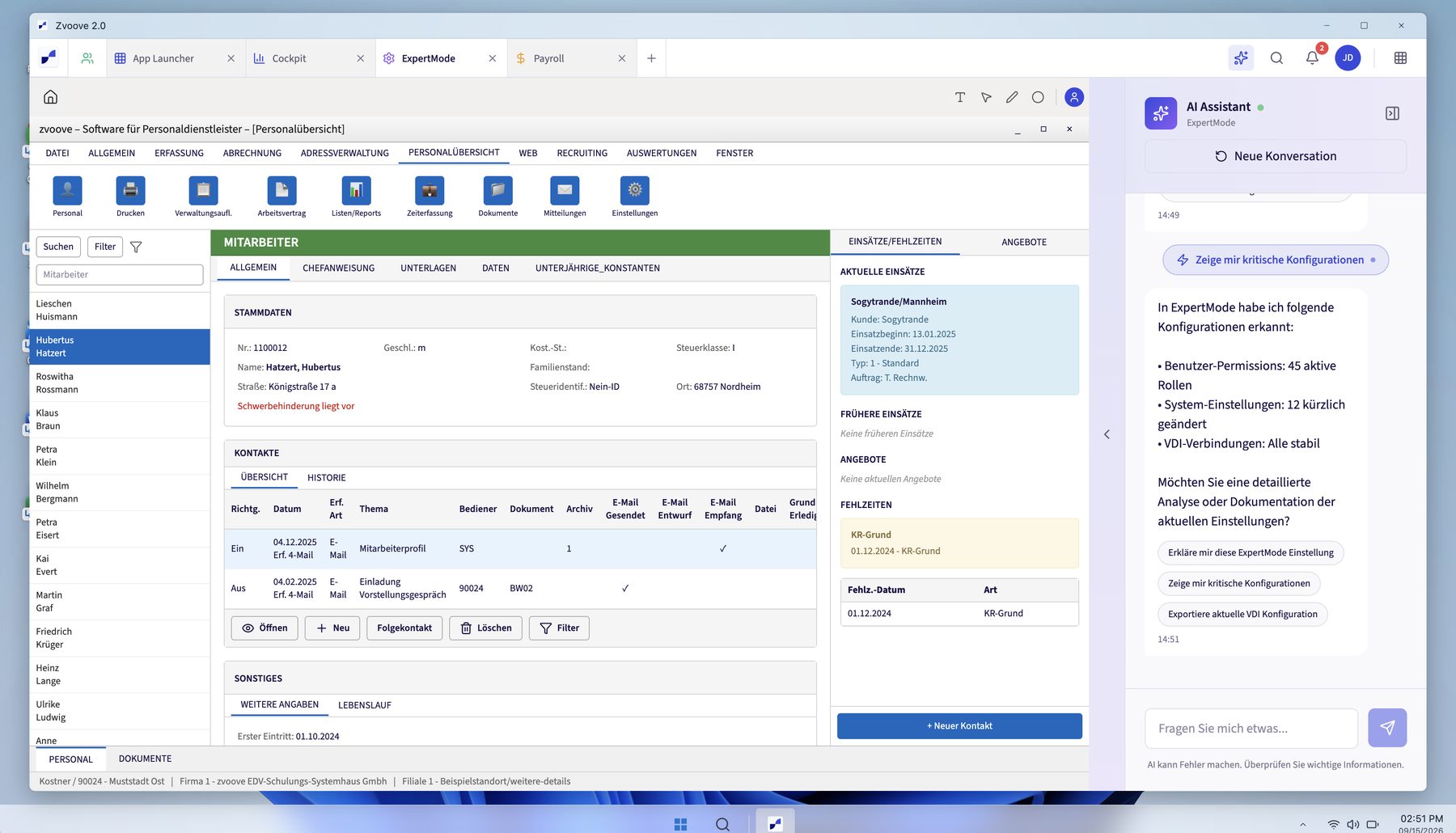
Use Figure with accurate alt text, caption, source and publication approval.
Primary source: src/components/Figure.astro
States: default · keyboard focus where interactive · light / dark · reduced motion
<Figure {...f1} class="max-w-text" />FigurePair
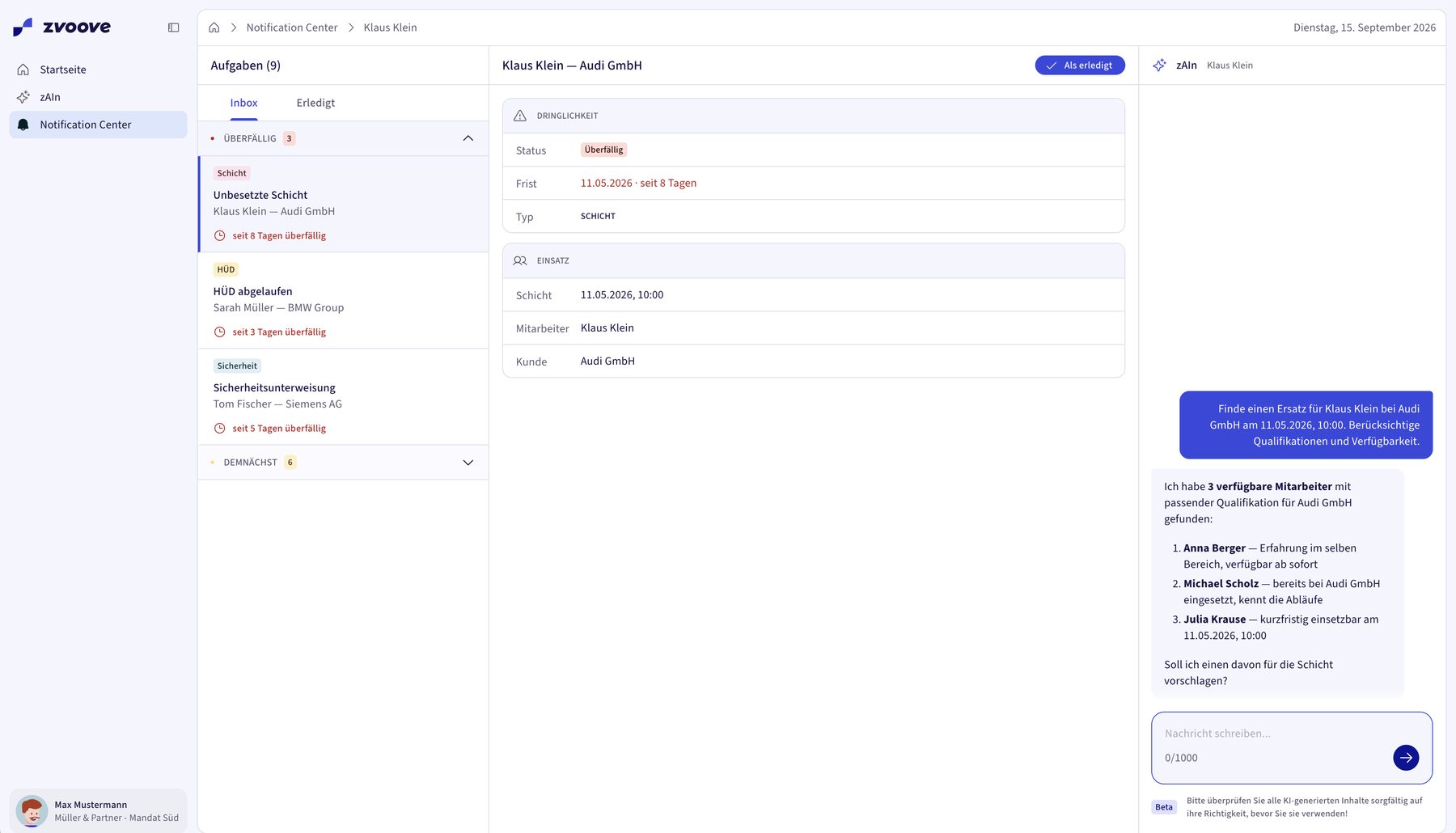
Reuse this composition from its source and demo. Keep its existing semantic structure and locale/data contracts.
Primary source: src/components/FigurePair.astro
src/components/Figure.astro
States: default · keyboard focus where interactive · light / dark · reduced motion
<FigurePair><Figure {...f1} /><Figure {...f2} /></FigurePair>FigureGrid
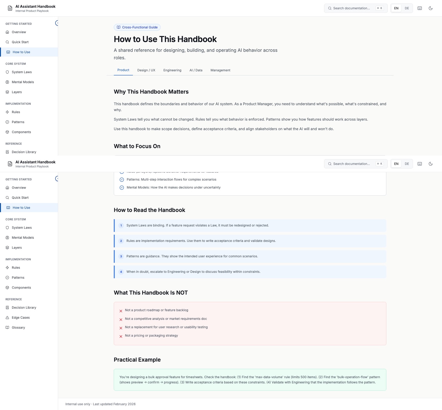
Reuse this composition from its source and demo. Keep its existing semantic structure and locale/data contracts.
Primary source: src/components/FigureGrid.astro
src/components/Figure.astro
States: default · keyboard focus where interactive · light / dark · reduced motion
<FigureGrid><Figure {...f1} /><Figure {...f2} /><Figure {...f3} /></FigureGrid>PageIntro · SectionHead
About
How I work, where I have worked and what came of it.
The roles, my responsibility and the products behind them.
Reuse this composition from its source and demo. Keep its existing semantic structure and locale/data contracts.
Primary source: src/components/PageIntro.astro
src/components/SectionHead.astro
States: default · keyboard focus where interactive · light / dark · reduced motion
<PageIntro as="h2" kicker={t(locale, 'intro.kicker')} title={t(locale, 'intro.title')} lead={t(locale, 'intro.lead')} />
  <SectionHead as="h3" title={t(locale, 'section.title')} lead={t(locale, 'section.lead')} />
FactGrid
Reuse this composition from its source and demo. Keep its existing semantic structure and locale/data contracts.
Primary source: src/components/FactGrid.astro
States: default · keyboard focus where interactive · light / dark · reduced motion
<FactGrid items={([1, 2, 3, 4] as const).map((n) => ({k: t(locale, `fact.${n}.k`), v: t(locale, `fact.${n}.v`)}))} />FileCard
Reuse this composition from its source and demo. Keep its existing semantic structure and locale/data contracts.
Primary source: src/components/FileCard.astro
src/components/Grid.astro
States: default · keyboard focus where interactive · light / dark · reduced motion
<Grid cols={2}>
    <FileCard href={t(locale, 'nav.cvHref')} title={t(locale, 'file.cvTitle')} meta={t(locale, 'file.cvMeta')} />
    <FileCard href={t(locale, 'file.cvWordHref')} title={t(locale, 'file.cvTitle')} meta={t(locale, 'file.cvWordMeta')} icon="file" />
  </Grid>
ContactBlock
Looking for someone to shape a complex product, lead a design team or build shared foundations? Get in touch.
max@does.systemsExplore the workReuse this composition from its source and demo. Keep its existing semantic structure and locale/data contracts.
Primary source: src/components/ContactBlock.astro
States: default · keyboard focus where interactive · light / dark · reduced motion
<ContactBlock locale={locale} />Case components
zvoove · Platform Experience & AI
From individual products to one shared platform.
I designed Launchpad, zAIn and Notification Center as one AI-enriched platform experience — from strategy to the production frontend, with reusable foundations for Product and Engineering.
As of September 2026
Live
Since August 2026: Launchpad, zAIn, Notification Center · 16 cloud customers, 12 active
Limited
48 write endpoints behind the human gate, not shipped
Proof
Action Center and Decision Card, not shipped yet
Not measured
Impact: no before-and-after comparison
My own case documentation for both projects and a letter of recommendation.
All screens show demo data. The warning levels are a schematic rebuild.
Financial results come from joint initiatives.
October 2026
Container xChange is a B2B marketplace for shipping containers. Its wallet brought together credits, income, invoices and credit limits, and every month 150–200 support requests came in about not understanding it. As Lead Designer, I reorganised the financial overview and connected payments to risk limits across two projects.
Reuse this composition from its source and demo. Keep its existing semantic structure and locale/data contracts.
Primary source: src/components/ds/CaseDemos.astro
src/components/case/CaseHero.astro
src/components/case/CaseNotes.astro
src/components/case/CaseRail.astro
src/components/case/CaseText.astro
States: default · keyboard focus where interactive · light / dark · reduced motion
<CaseHero content={cases[1]} locale={locale} demo/>
 <CaseRail content={finance} readTime={'8 '+t(locale,'case.minutes')} demo/>
 <CaseNotes notes={finance.notes} locale={locale}/>
 <CaseText locale={locale} text={finance.hero.lead}/>
p
More than 20 interviews and hundreds of support calls showed the same pattern: users did not understand their invoices or the categories and statuses of their transactions. Balances and open amounts were hard to follow, and there were no direct payment actions.
Data-driven case block. Read src/lib/case-schema.ts and docs/case-playbook.md; examples are rendered from existing approved case data, never author facts here.
Primary source: src/components/case/CaseBlock.astro
Variants: p
States: default · light / dark · reduced motion
<CaseBlock block={block} caseId={caseId} locale={locale} />callout
Data-driven case block. Read src/lib/case-schema.ts and docs/case-playbook.md; examples are rendered from existing approved case data, never author facts here.
Primary source: src/components/case/CaseBlock.astro
Variants: callout
States: default · light / dark · reduced motion
<CaseBlock block={block} caseId={caseId} locale={locale} />h3
Data-driven case block. Read src/lib/case-schema.ts and docs/case-playbook.md; examples are rendered from existing approved case data, never author facts here.
Primary source: src/components/case/CaseBlock.astro
Variants: h3
States: default · light / dark · reduced motion
<CaseBlock block={block} caseId={caseId} locale={locale} />pair
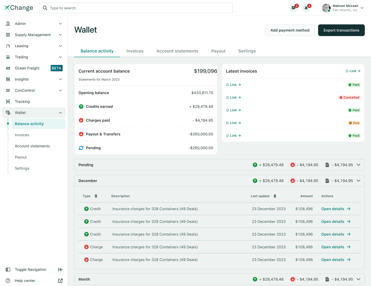
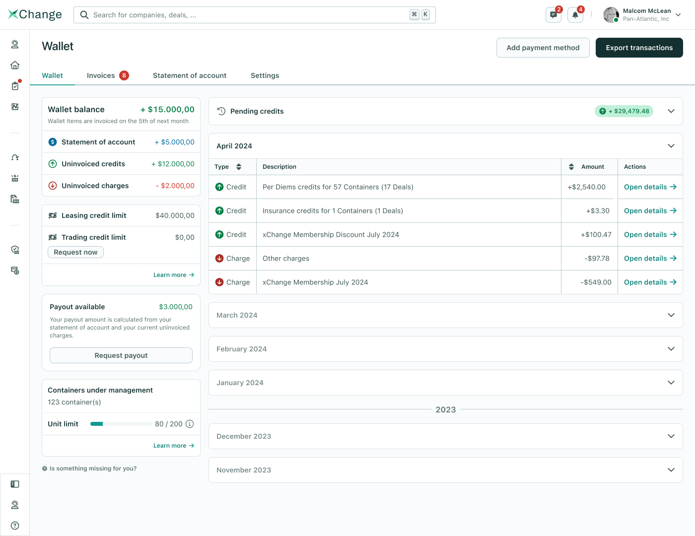
Data-driven case block. Read src/lib/case-schema.ts and docs/case-playbook.md; examples are rendered from existing approved case data, never author facts here.
Primary source: src/components/case/CaseBlock.astro
Variants: pair
States: default · light / dark · reduced motion
<CaseBlock block={block} caseId={caseId} locale={locale} />goals
Data-driven case block. Read src/lib/case-schema.ts and docs/case-playbook.md; examples are rendered from existing approved case data, never author facts here.
Primary source: src/components/case/CaseBlock.astro
Variants: goals
States: default · light / dark · reduced motion
<CaseBlock block={block} caseId={caseId} locale={locale} />learn
Data-driven case block. Read src/lib/case-schema.ts and docs/case-playbook.md; examples are rendered from existing approved case data, never author facts here.
Primary source: src/components/case/CaseBlock.astro
Variants: learn
States: default · light / dark · reduced motion
<CaseBlock block={block} caseId={caseId} locale={locale} />levels
Level 1 · Notice
Dismissible. Points to open invoices and the credit limit.
Level 2 · Payment request
Stays in place, with restrictions until payment.
Data-driven case block. Read src/lib/case-schema.ts and docs/case-playbook.md; examples are rendered from existing approved case data, never author facts here.
Primary source: src/components/case/CaseBlock.astro
Variants: levels
States: default · light / dark · reduced motion
<CaseBlock block={block} caseId={caseId} locale={locale} />figure
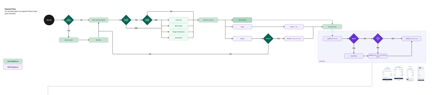
Data-driven case block. Read src/lib/case-schema.ts and docs/case-playbook.md; examples are rendered from existing approved case data, never author facts here.
Primary source: src/components/case/CaseBlock.astro
Variants: figure
States: default · light / dark · reduced motion
<CaseBlock block={block} caseId={caseId} locale={locale} />quote
Wallet 1.5 was meant as a stopgap and became the foundation for 2.0. Credit Limit reduced financial risk quickly and created building blocks that carried further payment flows.
Data-driven case block. Read src/lib/case-schema.ts and docs/case-playbook.md; examples are rendered from existing approved case data, never author facts here.
Primary source: src/components/case/CaseBlock.astro
Variants: quote
States: default · light / dark · reduced motion
<CaseBlock block={block} caseId={caseId} locale={locale} />list
A smaller stakeholder group
Too many participants slowed Credit Limit down. A more selective group would have been faster.
Protect focus
Wallet 1.5 could have shipped in half the time. Side projects with higher priority stretched the plan.
Refine earlier
The first warning UI needed adjustments after launch to become clearer.
Data-driven case block. Read src/lib/case-schema.ts and docs/case-playbook.md; examples are rendered from existing approved case data, never author facts here.
Primary source: src/components/case/CaseBlock.astro
Variants: list
States: default · light / dark · reduced motion
<CaseBlock block={block} caseId={caseId} locale={locale} />model-columns
December 2025
Small team · personal oversight
The classic overview is seen as unhelpful day to day — with a manageable team size you already know the situation. What matters is fast access to a single fact.
December 2025 · one day later
Larger operation · Expert Mode
Chat is rated “nice to have, but not essential”. The dashboard, by contrast, replaces the laborious search inside Expert Mode and is seen as the real gain.
Data-driven case block. Read src/lib/case-schema.ts and docs/case-playbook.md; examples are rendered from existing approved case data, never author facts here.
Primary source: src/components/case/CaseBlock.astro
Variants: model-columns
States: default · light / dark · reduced motion
<CaseBlock block={block} caseId={caseId} locale={locale} />facts
Research in numbers
~20
zAIn interviews, together with the PM
9
interviews on the Safety Manager, 5 external, 4 internal
2
customer shadowing sessions
11
participants in the discovery workshop
3
customers in the validation track
4
personas from the user insights synthesis
Data-driven case block. Read src/lib/case-schema.ts and docs/case-playbook.md; examples are rendered from existing approved case data, never author facts here.
Primary source: src/components/case/CaseBlock.astro
Variants: facts
States: default · light / dark · reduced motion
<CaseBlock block={block} caseId={caseId} locale={locale} />timeline
Further stops: Research Hub (July 2025), Safety Manager interviews, internal interviews with customer support, sales, key account and product, Master Unified Entry Experience, zCom, validation track with three customers.
Data-driven case block. Read src/lib/case-schema.ts and docs/case-playbook.md; examples are rendered from existing approved case data, never author facts here.
Primary source: src/components/case/CaseBlock.astro
Variants: timeline
States: default · light / dark · reduced motion
<CaseBlock block={block} caseId={caseId} locale={locale} />model-converge
Dispatch
Payroll and admin
Branch management
Recruiting
Shared pattern
All four roles reconstruct the case themselves before they can decide.
Data-driven case block. Read src/lib/case-schema.ts and docs/case-playbook.md; examples are rendered from existing approved case data, never author facts here.
Primary source: src/components/case/CaseBlock.astro
Variants: model-converge
States: default · light / dark · reduced motion
<CaseBlock block={block} caseId={caseId} locale={locale} />quotes
“If zvoove’s future product world looks LIKE THIS … it would be the first time in years that I’d even open a zvoove product again!”
“We really need an AI chat like this that knows the zvoove context. It makes a lot easier.”
Data-driven case block. Read src/lib/case-schema.ts and docs/case-playbook.md; examples are rendered from existing approved case data, never author facts here.
Primary source: src/components/case/CaseBlock.astro
Variants: quotes
States: default · light / dark · reduced motion
<CaseBlock block={block} caseId={caseId} locale={locale} />jobs
The four jobs to be done we identified share one core: understand the case before deciding, without piecing it together from several products. Per role, it looks like this:
DispatchJob story
Payroll and adminJob story
Branch managementJob story
RecruitingJob story
Data-driven case block. Read src/lib/case-schema.ts and docs/case-playbook.md; examples are rendered from existing approved case data, never author facts here.
Primary source: src/components/case/CaseBlock.astro
Variants: jobs
States: default · light / dark · reduced motion
<CaseBlock block={block} caseId={caseId} locale={locale} />arch
Classic ERPLegacy
own domain logic
Expert ModeLegacy
own domain logic
Cloud productsCloud
own domain logic
Platform experience · Launchpad
Domain logic stays where it is owned
Only what is needed across product boundaries becomes shared: identity, permissions, navigation, signals, context.
Not every product needs the same integration depth
Legacy and cloud connect at different depths; for users it stays consistent. Migration is not a precondition.
The proof became the central platform
The platform experience went live with Launchpad and is set down in the product guardrail as the central platform.
Data-driven case block. Read src/lib/case-schema.ts and docs/case-playbook.md; examples are rendered from existing approved case data, never author facts here.
Primary source: src/components/case/CaseBlock.astro
Variants: arch
States: default · light / dark · reduced motion
<CaseBlock block={block} caseId={caseId} locale={locale} />mine
Data-driven case block. Read src/lib/case-schema.ts and docs/case-playbook.md; examples are rendered from existing approved case data, never author facts here.
Primary source: src/components/case/CaseBlock.astro
Variants: mine
States: default · light / dark · reduced motion
<CaseBlock block={block} caseId={caseId} locale={locale} />mock-uee
Data-driven case block. Read src/lib/case-schema.ts and docs/case-playbook.md; examples are rendered from existing approved case data, never author facts here.
Primary source: src/components/case/CaseBlock.astro
Variants: mock-uee
States: default · light / dark · reduced motion
<CaseBlock block={block} caseId={caseId} locale={locale} />model-track
Signal
An event, an exception or a deadline appears.
Context
The system assembles only the relevant context.
Proposal
The next step is prepared, not merely suggested.
Approval
The prepared step becomes a deliberate human decision.
Action
Executed, escalated or stopped — logged and traceable.
The workflow starts at the signal, not the prompt — and carries context through to the decision.
Data-driven case block. Read src/lib/case-schema.ts and docs/case-playbook.md; examples are rendered from existing approved case data, never author facts here.
Primary source: src/components/case/CaseBlock.astro
Variants: model-track
States: default · light / dark · reduced motion
<CaseBlock block={block} caseId={caseId} locale={locale} />model-surfaces
Notification Centerby deadline and consequence
Open case
Cases4
| Case | Customer | Due | Status | zAIn suggestion | History |
|---|---|---|---|---|---|
| Early-shift cover | Audi GmbH | 11 May | Approval open | Schedule Anna BergerWell supported | |
| Sick note | DB Schenker | today | In review | Request the sick noteUncertain | |
| Extension | BMW Leipzig | 14 May | Prepared | Extend by 3 monthsWell supported | |
| Cancellation | VW AG | 16 May | Done | — |
The decision state must not fall apart when moving between these surfaces. That is why the prepared case needed its own persistent place.
Data-driven case block. Read src/lib/case-schema.ts and docs/case-playbook.md; examples are rendered from existing approved case data, never author facts here.
Primary source: src/components/case/CaseBlock.astro
Variants: model-surfaces
States: default · light / dark · reduced motion
<CaseBlock block={block} caseId={caseId} locale={locale} />dobj
Working-time conflict before payroll close
zAIn · Why well supported?
Data-driven case block. Read src/lib/case-schema.ts and docs/case-playbook.md; examples are rendered from existing approved case data, never author facts here.
Primary source: src/components/case/CaseBlock.astro
Variants: dobj
States: default · light / dark · reduced motion
<CaseBlock block={block} caseId={caseId} locale={locale} />model-compare
Withdrawn
92 % confidence
A percentage does not say what the assessment rests on or what would overturn it.
Evolved
Assessment with rationale
Interpretable uncertainty instead of apparent precision; colour orients, the popover shows what it is made of.
Data-driven case block. Read src/lib/case-schema.ts and docs/case-playbook.md; examples are rendered from existing approved case data, never author facts here.
Primary source: src/components/case/CaseBlock.astro
Variants: model-compare
States: default · light / dark · reduced motion
<CaseBlock block={block} caseId={caseId} locale={locale} />principles
Decision relevance before completeness
The flow shows only what affects trust and the decision; the rest stays reachable.
Interpretable uncertainty instead of a percentage
Named qualitatively, with the rule basis, open uncertainty and the next check.
Bundle context, layer detail
Evidence stays on the Decision Object; details appear on demand.
A standard case in about five seconds
A design target for prepared standard cases, not a time limit for consequential decisions.
Data-driven case block. Read src/lib/case-schema.ts and docs/case-playbook.md; examples are rendered from existing approved case data, never author facts here.
Primary source: src/components/case/CaseBlock.astro
Variants: principles
States: default · light / dark · reduced motion
<CaseBlock block={block} caseId={caseId} locale={locale} />model-rows
154 backend endpoints by read and write rights
Read
Retrieve context, Join data, Check rules
Allowed before approvalPrepare
Form a proposal, Show consequences, Stage the action
No system change yetChange
Write data, Change status, Execute action
Human GateThe boundary sits at the kind of action, not at a threshold someone can turn up.
Data-driven case block. Read src/lib/case-schema.ts and docs/case-playbook.md; examples are rendered from existing approved case data, never author facts here.
Primary source: src/components/case/CaseBlock.astro
Variants: model-rows
States: default · light / dark · reduced motion
<CaseBlock block={block} caseId={caseId} locale={locale} />model-bands
Confidence
Refill shiftApproval required
I will prepare a replacement. Nothing runs until you approve.
Fill shiftApproval required
Schedule Anna Berger for Audi GmbH on 11 May 2026, 06:00.
BetaPlease check all AI-generated content carefully.
Data-driven case block. Read src/lib/case-schema.ts and docs/case-playbook.md; examples are rendered from existing approved case data, never author facts here.
Primary source: src/components/case/CaseBlock.astro
Variants: model-bands
States: default · light / dark · reduced motion
<CaseBlock block={block} caseId={caseId} locale={locale} />model-doc
Boundary detected
Hands over the prepared case instead of acting further. It stops before the action, not midway through it.
Decision context
Judgement stays connected
Check, adjust, decide — from the state the system reached, not from the state before the signal.
What is handed over: the situation, the next step and what remained open.
Data-driven case block. Read src/lib/case-schema.ts and docs/case-playbook.md; examples are rendered from existing approved case data, never author facts here.
Primary source: src/components/case/CaseBlock.astro
Variants: model-doc
States: default · light / dark · reduced motion
<CaseBlock block={block} caseId={caseId} locale={locale} />model-layers
Understand
Interpretation, clarification, handoff. What the system understood is visible before it plans anything.
Plan
Sequence and steps. For write actions the approval sits here — the action is visible before execution.
Plan · 3 stepsApproval required
Check candidates → schedule Anna Berger → inform the customer
Decide
Output, confirmation, next step. The result stays attached to the case and remains traceable.
Plan · 3 stepsDone
Check candidates → schedule Anna Berger → inform the customer
Anna Berger is scheduled and logged on the case. Can be undone at any time.
Autonomy, handoff and approval are written down as reusable rules.
Data-driven case block. Read src/lib/case-schema.ts and docs/case-playbook.md; examples are rendered from existing approved case data, never author facts here.
Primary source: src/components/case/CaseBlock.astro
Variants: model-layers
States: default · light / dark · reduced motion
<CaseBlock block={block} caseId={caseId} locale={locale} />model-modes
Explore
Make the product thesis testable
While the experience is still moving. Four days to customer validation.
Prove
Test behaviour in the real system
When behaviour is part of the hypothesis: on the real stack.
Enable
Make what worked reusable
What held up becomes a component, token or rule.
As close to code as makes sense, as cheap to change as necessary.
Data-driven case block. Read src/lib/case-schema.ts and docs/case-playbook.md; examples are rendered from existing approved case data, never author facts here.
Primary source: src/components/case/CaseBlock.astro
Variants: model-modes
States: default · light / dark · reduced motion
<CaseBlock block={block} caseId={caseId} locale={locale} />model-map
UnityUI
I own UnityUI on the design side. One source, one version: deviations surface in the pipeline, not in review.
Code · package registry
Products build on the published package.
Design tool · Figma
The same version as in code.
AI tools
Defined with the frontend lead: prototypes are built on real components.
Data-driven case block. Read src/lib/case-schema.ts and docs/case-playbook.md; examples are rendered from existing approved case data, never author facts here.
Primary source: src/components/case/CaseBlock.astro
Variants: model-map
States: default · light / dark · reduced motion
<CaseBlock block={block} caseId={caseId} locale={locale} />ledger
In productionLive4 entries
Platform experience
Shell, app launcher, rights and roles, settings; anchored as the central platform.
Signals · Notification Center
Deadline- and risk-relevant signals, prioritised by impact. I built the frontend and shipped it with a backend engineer. Eight weeks were planned. After two I was moved to other priorities; the frontend was done, the backend half done.
Context-aware assistant
Proposes from the context of where someone works; context can also come from a notification.
Enablement
Skill repository, UnityUI guardrails and tool setup run in production.
Design & proof2 entries
Human gate and confidence
Limited
Patterns designed; the write endpoints are not shipped.
Action Center and Decision Card
Proof
Technical proof started, not shipped yet.
Pending1 entry
Impact
Pending
No before-and-after measured; that would need a baseline and telemetry.
Data-driven case block. Read src/lib/case-schema.ts and docs/case-playbook.md; examples are rendered from existing approved case data, never author facts here.
Primary source: src/components/case/CaseBlock.astro
Variants: ledger
States: default · light / dark · reduced motion
<CaseBlock block={block} caseId={caseId} locale={locale} />model-tabs
Four patterns
Pattern 01
Authority stays with the person when the decision moves money
The system recognises, prepares and explains. Approval stays with the person who carries the consequence, from the start, not as a safety layer added later.
Pattern 02
Read before write, opened in stages
What the system may not do is designed as deliberately as what it may do. It opens by impact, permission and reversibility.
Pattern 03
Autonomy is a level per decision type, not a switch for the product
Filling a routine shift and changing someone’s pay are not the same decision.
Pattern 04
Escalation is a handover format
Whoever takes over should see that someone carries on, not that something starts from scratch.
Data-driven case block. Read src/lib/case-schema.ts and docs/case-playbook.md; examples are rendered from existing approved case data, never author facts here.
Primary source: src/components/case/CaseBlock.astro
Variants: model-tabs
States: default · light / dark · reduced motion
<CaseBlock block={block} caseId={caseId} locale={locale} />model-disclose
Role and craft · four proof points
Alongside the running product business, UWX took shape: the AI experience across all products. There was no brief and no established pattern; as the only designer I defined the area from the ground up, from contextual AI and signals to human-in-the-loop. Today UWX is established and in use.
The first hypothesis was in front of a customer after four days as a running prototype. One session later I discarded it rather than defend it — the tangible thing first, the insight second.
The Decision Center was designed but too large to ship. Cut back to a notification experience — with the data structure underneath that later becomes decision objects. The slice went live.
Interviews, shadowing and support conversations run and analysed myself — and the product direction re-aimed twice because of them. Research as a corrective, not as confirmation.
Product and engineering produce testable prototypes themselves. What comes out is consistent because the foundation is given — not because I saw every file.
Data-driven case block. Read src/lib/case-schema.ts and docs/case-playbook.md; examples are rendered from existing approved case data, never author facts here.
Primary source: src/components/case/CaseBlock.astro
Variants: model-disclose
States: default · light / dark · reduced motion
<CaseBlock block={block} caseId={caseId} locale={locale} />model-chat
Text
Table
Available · forklift licence
| J. Weber | Forklift licence | from Mon |
| A. Yilmaz | Forklift licence | from Tue |
| M. Nowak | Forklift licence | from Wed |
Card
Assignment · Jonas Weber
Open in the ERP
Video
Create a new customer2:40
Data-driven case block. Read src/lib/case-schema.ts and docs/case-playbook.md; examples are rendered from existing approved case data, never author facts here.
Primary source: src/components/case/CaseBlock.astro
Variants: model-chat
States: default · light / dark · reduced motion
<CaseBlock block={block} caseId={caseId} locale={locale} />model-cards
Message
Understand
What zAIn understood becomes visible before it plans anything.
Intent
Plan
The steps are shown before they run; for write actions, approval sits here.
Result
Result
The result stays attached to the case and traceable.
Data-driven case block. Read src/lib/case-schema.ts and docs/case-playbook.md; examples are rendered from existing approved case data, never author facts here.
Primary source: src/components/case/CaseBlock.astro
Variants: model-cards
States: default · light / dark · reduced motion
<CaseBlock block={block} caseId={caseId} locale={locale} />model-rule
An input allows more than one reading.
Two or three clear readings as a choice, more than three as a follow-up question.
Two readings, so a choice.
Data-driven case block. Read src/lib/case-schema.ts and docs/case-playbook.md; examples are rendered from existing approved case data, never author facts here.
Primary source: src/components/case/CaseBlock.astro
Variants: model-rule
States: default · light / dark · reduced motion
<CaseBlock block={block} caseId={caseId} locale={locale} />model-team
Guild
First foundations alongside day-to-day work, laid by me
Product designer
Brought in with my design lead, reporting to me
Systems team
Me as Design Systems Team Lead and lead designer
With engineering
Later 2 design, 1 QA, 2 engineering
Data-driven case block. Read src/lib/case-schema.ts and docs/case-playbook.md; examples are rendered from existing approved case data, never author facts here.
Primary source: src/components/case/CaseBlock.astro
Variants: model-team
States: default · light / dark · last stage highlighted · 390 px stacked
<CaseBlock block={block} caseId={caseId} locale={locale} />model-rings
Data-driven case block. Read src/lib/case-schema.ts and docs/case-playbook.md; examples are rendered from existing approved case data, never author facts here.
Primary source: src/components/case/CaseBlock.astro
Variants: model-rings
States: default · light / dark · reduced motion
<CaseBlock block={block} caseId={caseId} locale={locale} />lab
The grammar of the tokens
Data-driven case block that embeds one live, reconstructed component from max.lab (/lab/). Read src/lib/case-schema.ts; the lab is built separately and only ships reconstructions, never original employer code.
Primary source: src/components/case/CaseBlock.astro
src/components/case/CaseLab.astro
Variants: lab
States: default · light / dark · reduced motion
<CaseBlock block={block} caseId={caseId} locale={locale} />bars
1 · One-offsOne-offsEvery design a one-off, so-called snowflakes.2 · MixMixOne-offs and global components, adapted personally.3 · Adapt and give backAdapt and give backAdapt global components and give the change back to the system.4 · Extend by the rulesExtend by the rulesUse global components, extend them by set rules or request new variants.5 · Global components onlyGlobal components onlyWithout any adaptation.
One answer per designer.
Data-driven case block. Read src/lib/case-schema.ts and docs/case-playbook.md; examples are rendered from existing approved case data, never author facts here.
Primary source: src/components/case/CaseBlock.astro
Variants: bars
States: default · light / dark · reduced motion
<CaseBlock block={block} caseId={caseId} locale={locale} />model-growth
Data-driven case block. Read src/lib/case-schema.ts and docs/case-playbook.md; examples are rendered from existing approved case data, never author facts here.
Primary source: src/components/case/CaseBlock.astro
Variants: model-growth
States: default · light / dark · reduced motion
<CaseBlock block={block} caseId={caseId} locale={locale} />goals-board
15 components and modules documented to our MVP definition
Reached in T2 2023.
O1 · Usability and maintainability
Brand and marketing guidelines fully in Zeroheightopen
Started: brand and marketing took on ownership, but it was not complete within the trimester.
O1 · Usability and maintainability
Change communication strategycut
Cut on purpose: there were not enough people for a communication strategy of its own.
O1 · Usability and maintainability
At least 2 qualitative and quantitative impact metrics
Reached in T2 2023.
O2 · Make product impact measurable
Remaining share of the old kit in code, for deprecationcut
Cut on purpose: where the old kit still sat in the code could not be found reliably.
O2 · Make product impact measurable
Responsive criteria defined
Reached in T2 2023.
O3 · High-quality design output
All 57 components meet the criteria
Reached in T2 2023.
O3 · High-quality design output
Data-driven case block. Read src/lib/case-schema.ts and docs/case-playbook.md; examples are rendered from existing approved case data, never author facts here.
Primary source: src/components/case/CaseBlock.astro
Variants: goals-board
States: default · light / dark · reduced motion
<CaseBlock block={block} caseId={caseId} locale={locale} />model-flow
Strand 1
PM skills
Specs, tickets and design tasks in the same structure, with personas and domain terms from the shared foundation.
Strand 2
AI-ready design system
UnityUI with tokens and components that AI tools apply correctly.
Result
Near-live prototypes
Product managers use them to validate on their own, run discovery and back up tickets and requirements. We work together in Claude Design or Figma Make until I take over the detailing and the states.
Data-driven case block. Read src/lib/case-schema.ts and docs/case-playbook.md; examples are rendered from existing approved case data, never author facts here.
Primary source: src/components/case/CaseBlock.astro
Variants: model-flow
States: default · light / dark · reduced motion
<CaseBlock block={block} caseId={caseId} locale={locale} />model-pmflow
BeforeFeedback after the build
With the skillsFeedback before the first ticket
Data-driven case block. Read src/lib/case-schema.ts and docs/case-playbook.md; examples are rendered from existing approved case data, never author facts here.
Primary source: src/components/case/CaseBlock.astro
Variants: model-pmflow
States: default · light / dark · reduced motion
<CaseBlock block={block} caseId={caseId} locale={locale} />model-pipeline
01Spec
A sentence, a Figma link or meeting notes become a buildable spec: persona, problem, user stories, acceptance criteria, edge cases.
02Design refinement
Every ticket with a user-facing surface gets its design task. It covers flow, error behaviour, states, permissions, copy and translation and stays in sync with the ticket.
03Figma to UnityUI
Spacing, typography, colours and layout come from Figma and are translated into UnityUI code, checked against the design tokens.
checked against the design tokens
04Quality gate
Every component is checked from six angles: code quality, design system compliance, accessibility, security, performance, completeness, with severities from P0 to P3.
Severities P0 to P3
05Handover
A ten-part package with context, architecture decisions, test instructions and a quick start for reviewers.
ten-part package
Data-driven case block. Read src/lib/case-schema.ts and docs/case-playbook.md; examples are rendered from existing approved case data, never author facts here.
Primary source: src/components/case/CaseBlock.astro
Variants: model-pipeline
States: default · light / dark · reduced motion
<CaseBlock block={block} caseId={caseId} locale={locale} />model-terminal
Data-driven case block. Read src/lib/case-schema.ts and docs/case-playbook.md; examples are rendered from existing approved case data, never author facts here.
Primary source: src/components/case/CaseBlock.astro
Variants: model-terminal
States: default · light / dark · reduced motion
<CaseBlock block={block} caseId={caseId} locale={locale} />model-darkfactory
01Export timesheets as CSVcreated with the PM ticket skill02Pipelineagents implement · Engineering03Quality gate04Codefor review
ZVS-1482
Export timesheets as CSV
darkfactoryon
Pipeline
Quality gateP0–P3
Code
Pull request
Export timesheets as CSV
Checks passed
waits for review from Engineering
My part
From zvoove Skills. Engineering owns the pipeline; my part is the material it draws on.
Level 5 of 5agents implement tickets on their own
Data-driven case block. Read src/lib/case-schema.ts and docs/case-playbook.md; examples are rendered from existing approved case data, never author facts here.
Primary source: src/components/case/CaseBlock.astro
Variants: model-darkfactory
States: default · light / dark · reduced motion
<CaseBlock block={block} caseId={caseId} locale={locale} />mock-gdpr
Data-driven case block. Read src/lib/case-schema.ts and docs/case-playbook.md; examples are rendered from existing approved case data, never author facts here.
Primary source: src/components/case/CaseBlock.astro
Variants: mock-gdpr
States: default · light / dark · reduced motion
<CaseBlock block={block} caseId={caseId} locale={locale} />mock-shapes
Six shapes, one grammar
| Shape | 01Message | 02Intent | 03Result | Typical trigger | |
|---|---|---|---|---|---|
| Message | without Intent | without Result | “When does the early shift in Kiel start?” | ||
| without Message | without Intent | Result | from the systemForklift licence expires in 14 days | ||
| Message | Intent | without Result | “Put Anna Berger on the early shift.” | ||
| Message | without Intent | Result | “Who is free next week?” | ||
| without Message | Intent | Result | scheduledFriday 2 pm: missing timesheets | ||
| Message | Intent | Result | “Can you find cover for Jonas Weber?” | ||
Data-driven case block. Read src/lib/case-schema.ts and docs/case-playbook.md; examples are rendered from existing approved case data, never author facts here.
Primary source: src/components/case/CaseBlock.astro
Variants: mock-shapes
States: default · light / dark · reduced motion
<CaseBlock block={block} caseId={caseId} locale={locale} />mock-levels
What earns a consent
Read freely
What dispatchers already see. The plan approval covers it.
Read, but logged
Shown without interruption; the access goes into the log.
Masked until consent
Never shown in full without consent for exactly this field. The plan approval does not cover it.
Data-driven case block. Read src/lib/case-schema.ts and docs/case-playbook.md; examples are rendered from existing approved case data, never author facts here.
Primary source: src/components/case/CaseBlock.astro
Variants: mock-levels
States: default · light / dark · reduced motion
<CaseBlock block={block} caseId={caseId} locale={locale} />mock-demo
Two requests, one structure
Data-driven case block. Read src/lib/case-schema.ts and docs/case-playbook.md; examples are rendered from existing approved case data, never author facts here.
Primary source: src/components/case/CaseBlock.astro
Variants: mock-demo
States: default · light / dark · reduced motion
<CaseBlock block={block} caseId={caseId} locale={locale} />mock-slice
Signal
Understand
Decide
Impact
Data-driven case block. Read src/lib/case-schema.ts and docs/case-playbook.md; examples are rendered from existing approved case data, never author facts here.
Primary source: src/components/case/CaseBlock.astro
Variants: mock-slice
States: default · light / dark · reduced motion
<CaseBlock block={block} caseId={caseId} locale={locale} />phases
GDPR card
A confirmation in the zAIn chat before sensitive employee data is read. Live, reading and planning.
Three-layer pattern
Understand, plan, result; field consent kept apart from plan approval.
UWX
One model for AI-supported work across all products; concept and PM guide in August 2026.
PM enablement
The vision-system prototype (3/6/9) for the product managers, September 2026.
Product strategy
UEE and UWX are anchored in the 2026 and 2027 product strategy.
Data-driven case block. Read src/lib/case-schema.ts and docs/case-playbook.md; examples are rendered from existing approved case data, never author facts here.
Primary source: src/components/case/CaseBlock.astro
Variants: phases
States: default · light / dark · reduced motion
<CaseBlock block={block} caseId={caseId} locale={locale} />model-anatomy
Sample
Rules
patterns/decision.md---
pattern: decision
source: docs/case-playbook.md
---
## Anatomy
1. Marker [mark] — Glyph and kind of note, so the decision stands out from the running text
2. Title [title] — Names the decision as a statement
3. Reason and cost [body] — Why it was decided this way, and what it cost
## Rules
- DO: One decision per chapter, with its cost.
- DO: Headings as statements.
- DO: Only what portfolio.os can back up.
- DON’T: Claiming impact that wasn’t measured.The rules are shortened from the case playbook.
Data-driven case block. Read src/lib/case-schema.ts and docs/case-playbook.md; examples are rendered from existing approved case data, never author facts here.
Primary source: src/components/case/CaseBlock.astro
Variants: model-anatomy
States: default · light / dark · part focused · file open · 390 px stacked
<CaseBlock block={block} caseId={caseId} locale={locale} />model-journey
Autumn 2025
Figma Make
Prototypes in hours, plus the first guidelines and skills.
Claude Code
A skills repository for knowledge, QA, migration and the route from Figma to UnityUI.
Claude
The same skill in the app, even without a code environment.
Cursor
A login flow with 16 screens in three layouts in one day.
Lovable
Prototypes by the innovation hub. We picked up their results, which helped make Code Connect feasible.
Figma agent
Builds designs with the Figma library. A skill of mine adds the design part, prompt included, to every technical PM ticket; the agent builds the base, I refine it.
Autumn 2026 · decision
Claude Design
The VP of Engineering and the VP of Product make Claude Design everyone's prototyping tool. We rebuild the system for it, in Claude Design's structure.
Data-driven case block. Read src/lib/case-schema.ts and docs/case-playbook.md; examples are rendered from existing approved case data, never author facts here.
Primary source: src/components/case/CaseBlock.astro
Variants: model-journey
States: default · light / dark · gate station · 390 px stacked
<CaseBlock block={block} caseId={caseId} locale={locale} />model-audit
1Perceivable4
2Operable2
3Understandable1
4Robust2
Checks from the QA skill and the review skill; the mapping to WCAG success criteria is mine.
Data-driven case block. Read src/lib/case-schema.ts and docs/case-playbook.md; examples are rendered from existing approved case data, never author facts here.
Primary source: src/components/case/CaseBlock.astro
Variants: model-audit
States: default · light / dark · level A / AA · 390 px stacked
<CaseBlock block={block} caseId={caseId} locale={locale} />The shared base for every case’s scroll story: start, line, stations, navigation and finale. Each case varies its stations, visuals and finale; the base stays the same.
Roles for story and case
--brand--brand-soft--brand-line--brand-chip-line--thread-line--panel-glass--glass-edge--mark-jira--ok--danger-line.case-path.darkReuse this composition from its source and demo. Keep its existing semantic structure and locale/data contracts.
Primary source: src/components/ds/StoryDemos.astro
States: default · keyboard focus where interactive · light / dark · reduced motion
<div class="ds-roles">{roles.map(r=><span class="ds-role"><i style={`background:var(--${r})`}></i><code>--{r}</code></span>)}<span class="ds-role"><i class="ds-role__ink"></i><code>.case-path.dark</code></span></div>Case head with a story: start and “Read the case” (↵), results on the status
Initiative case · AI enablement · Designing with AIzvoove · staffing software · 2025 – 2026
My working rules became the team’s AI infrastructure.
As the only designer for several teams, I built myself workflows and skills to keep up. On my own initiative this became zvoove Skills: the shared AI library of Product, Design and Engineering.
As of September 2026
Live
Since March 2026: 19 skills at launch, 34 across three departments in August 2026
In use
Dark Factory with the developers since August 2026, the pipeline belongs to Engineering
Open
Measured internally by tickets done
Reuse this composition from its source and demo. Keep its existing semantic structure and locale/data contracts.
Primary source: src/components/ds/StoryDemos.astro
src/components/case/CaseHero.astro
States: default · keyboard focus where interactive · light / dark · reduced motion
<div class="case-hero-stage ds-story--hero"><div class="case-frame"><CaseHero content={c} locale={locale} demo story/></div></div>Start and “Start again” (pill with a light on its border, binary stream on hover)
Reuse this composition from its source and demo. Keep its existing semantic structure and locale/data contracts.
Primary source: src/components/story/StoryStart.astro
States: default · keyboard focus where interactive · light / dark · reduced motion
<div class="ds-story ds-story--light ds-story--row"><StoryStart locale={locale} demo/><StoryStart locale={locale} demo again/></div>Dock: back · next | skip to the case
Reuse this composition from its source and demo. Keep its existing semantic structure and locale/data contracts.
Primary source: src/components/story/StoryDock.astro
States: default · keyboard focus where interactive · light / dark · reduced motion
<div class="ds-story case-path dark"><StoryDock skip={skip} demo/></div>Shared platform
Each program keeps doing its job
One shared platform
Sign-in and accessWho can see and change what?
Switch between programsAll programs in one place
Reuse this composition from its source and demo. Keep its existing semantic structure and locale/data contracts.
Primary source: src/components/ds/StoryDemos.astro
src/components/story/StoryScene.astro
States: default · keyboard focus where interactive · light / dark · reduced motion
<div class="ds-story case-path dark"><StoryScene name="lanes" locale={locale}/></div>Messages become a signal
StaffingMon 06:00 · 2 shifts open
AbsencesSick note J. B. · from Monday
Expert ModeShift plan: Mon 06:00 unfilled
MailNorth: who covers Mon 06:00?
4 messages → 1 task
2 shifts on Mon 06:00 unfilled
detected 05:51 · before anyone asked
Reuse this composition from its source and demo. Keep its existing semantic structure and locale/data contracts.
Primary source: src/components/ds/StoryDemos.astro
src/components/story/StoryScene.astro
States: default · keyboard focus where interactive · light / dark · reduced motion
<div class="ds-story case-path dark"><StoryScene name="signal" locale={locale}/></div>Building the Decision Object
Monday, 06:00 · Logistics North · 8 hours per person
M. K. only has 2 hours available. The shift needs 8.
2 of 8 hours covered2 hours available
8 of 8 hours covered9 hours available
Based onShift planHours balanceQualification
The hours conflict is documented. A replacement for M. K. is still needed.
Reuse this composition from its source and demo. Keep its existing semantic structure and locale/data contracts.
Primary source: src/components/ds/StoryDemos.astro
src/components/story/StoryScene.astro
States: default · keyboard focus where interactive · light / dark · reduced motion
<div class="ds-story case-path dark"><StoryScene name="dobj" locale={locale}/></div>zAIn conversation
⌂Notification Center›J. B.Monday, 19 October 2026
Tasks (9)
InboxDone
OVERDUE3
J. B. — Logistik Nord✓ Mark done
✦zAIn can propose a replacement for J. B. on Mon 06:00.Hand to zAIn
URGENCY
StatusOverdue
DueMo 05:30
TypeSHIFT
Reuse this composition from its source and demo. Keep its existing semantic structure and locale/data contracts.
Primary source: src/components/ds/StoryDemos.astro
src/components/story/StoryScene.astro
States: default · keyboard focus where interactive · light / dark · reduced motion
<div class="ds-story case-path dark"><StoryScene name="zain" locale={locale}/></div>Decisions build the dashboard
⌂HomeMonday, 19 October 2026
Your morning at a glance
The early shifts are covered. Next up: the timesheets.
Week 42Time trackingStaffing
The matching proposals are ready. Check which assignment each timesheet belongs to.
The proposal is open for review. Nothing has been approved or carried out.
Only your approval changes the assignment.
Approved by you. Both shifts saved in the shift plan.
The updated shift plan is available to the other programs. No need to enter it again.
Reuse this composition from its source and demo. Keep its existing semantic structure and locale/data contracts.
Primary source: src/components/ds/StoryDemos.astro
src/components/story/StoryScene.astro
States: default · keyboard focus where interactive · light / dark · reduced motion
<div class="ds-story case-path dark"><StoryScene name="dash" locale={locale}/></div>Station, reached
01
Solve my own problem first
write the way I work down instead of repeating it.
Starting point
What slowed things down
The decision
Instead of explaining the same things every day, I wrote down how I work. At first just for me. Then it turned out others could work with it just as well.
Reuse this composition from its source and demo. Keep its existing semantic structure and locale/data contracts.
Primary source: src/components/story/StoryStation.astro
States: default · keyboard focus where interactive · light / dark · reduced motion
<div class="ds-story case-path dark"><ol class="case-path__steps"><StoryStation i={story.steps[withCards]} n={withCards} art={arts[story.steps[withCards].id]} locale={locale} zoomLabel={t(locale,'case.zoom')} lit/></ol></div>Station with a rebuilt interface
02
Connect knowledge instead of copying it
the knowledge base via MCP, improved together with its team.
MCP
knowledge-base · search3 results
A customer export needs 9 of the 14 fields: employee, assignment, date, start, end, breaks, hours, surcharges and approval. Internal cost centres stay out.
1Timesheet · data model2Export · CSV and PDF3Persona · dispatcher
Rebuilt: an agent queries the Knowledge Base over MCP instead of someone pasting context into every session.
Reuse this composition from its source and demo. Keep its existing semantic structure and locale/data contracts.
Primary source: src/components/ds/StoryDemos.astro
src/components/story/StoryStation.astro
States: default · keyboard focus where interactive · light / dark · reduced motion
<div class="ds-story case-path dark"><ol class="case-path__steps"><StoryStation i={story.steps[withMock]} n={withMock} art={arts[story.steps[withMock].id]} locale={locale} zoomLabel={t(locale,'case.zoom')} lit/></ol></div>Learning band
Learning
A skill is only as good as the knowledge it is connected to. Improving the access was worth more than any additional prompt.
Reuse this composition from its source and demo. Keep its existing semantic structure and locale/data contracts.
Primary source: src/components/ds/StoryDemos.astro
src/components/case/CaseHighlight.astro
States: default · keyboard focus where interactive · light / dark · reduced motion · ink (breaker before the first chapter, tone="ink" with lead)
<CaseHighlight b={band}/>Tooltip
Reuse this composition from its source and demo. Keep its existing semantic structure and locale/data contracts.
Primary source: src/components/ds/StoryDemos.astro
src/components/case/CaseTip.astro
States: default · keyboard focus where interactive · light / dark · reduced motion
<div class="ds-tips"><CaseTip k="01" t={story.steps[0].t} b={story.steps[0].b} locale={locale}/><CaseTip k="19" t={c.hero.h1} locale={locale}/></div>More cases
Reuse this composition from its source and demo. Keep its existing semantic structure and locale/data contracts.
Primary source: src/components/ds/StoryDemos.astro
src/components/case/CasePager.astro
States: default · keyboard focus where interactive · light / dark · reduced motion
<CasePager prev={link(others[0],'design-systems')} next={link(others[1],'product-systems')} locale={locale}/>Case notes
Reuse this composition from its source and demo. Keep its existing semantic structure and locale/data contracts.
Primary source: src/components/ds/StoryDemos.astro
src/components/case/CaseFooter.astro
States: default · keyboard focus where interactive · light / dark · reduced motion
<CaseFooter notes={c.notes} locale={locale}/>Motion
Glides use a sine ease; their duration grows with the distance. A next step runs in two legs: the line to the number, a short pause, then on to the cards. Everything pauses out of view and is off under reduced motion.
Reuse this composition from its source and demo. Keep its existing semantic structure and locale/data contracts.
Primary source: src/components/ds/StoryDemos.astro
States: default · keyboard focus where interactive · light / dark · reduced motion
<p class="max-w-text text-sm text-ink-muted">{t(locale,'ds.storyMotionNote')}</p>The shared parts of Home, Work, About and Tools: panel with its crumb bar, row list, „Built with“, ⌘K palette and keys sheet, and the rules of the beacon.
Panel
One header for the whole surface; it names the section one is reading.
Reuse this composition from its source and demo. Keep its existing semantic structure and locale/data contracts.
Primary source: src/components/ds/MainPageDemos.astro
src/components/Keycap.astro
src/components/site/RowList.astro
src/components/site/Section.astro
src/components/site/Surface.astro
States: default · keyboard focus where interactive · light / dark · reduced motion
<Surface root="Home" first={ui.work}>
   <Section section="demo-a" title={ui.work} count="03"><Fragment slot="meta"><Keycap>J</Keycap><Keycap>K</Keycap><em>{ui.navigate}</em></Fragment><RowList items={rows}/></Section>
   <Section section="demo-b" title={ui.about}><p class="ds-main__pad">{en?'One header for the whole surface; it names the section one is reading.':'Ein Kopf für die ganze Fläche; er nennt den Abschnitt, in dem man gerade liest.'}</p></Section>
  </Surface>
Row list
Reuse this composition from its source and demo. Keep its existing semantic structure and locale/data contracts.
Primary source: src/components/ds/MainPageDemos.astro
src/components/site/RowList.astro
src/components/site/Section.astro
States: default · keyboard focus where interactive · light / dark · reduced motion
<Section section="demo-rows" title={ui.cases} count="03"><RowList items={rows}/></Section>Built with
Reuse this composition from its source and demo. Keep its existing semantic structure and locale/data contracts.
Primary source: src/components/ds/MainPageDemos.astro
src/components/site/BuiltWith.astro
States: default · keyboard focus where interactive · light / dark · reduced motion
<BuiltWith locale={locale}/>⌘K palette
Where to? Cases, pages, contact …Esc
↑↓choose↵open?Keys
Reuse this composition from its source and demo. Keep its existing semantic structure and locale/data contracts.
Primary source: src/components/ds/MainPageDemos.astro
src/components/Keycap.astro
src/components/Zeichen.astro
States: default · keyboard focus where interactive · light / dark · reduced motion
<div class="sx-cmd sx-cmd--demo" data-demo-static>
   <div class="sx-cmd__in">
    <p class="sx-cmd__top"><Zeichen icon="search" size={16}/><span class="sx-cmd__q">{ui.cmdPlaceholder}</span><Keycap>Esc</Keycap></p>
    <ul class="sx-cmd__list">{places.slice(0,6).map((p,i)=><li aria-selected={i===0?'true':'false'}><span class="sx-cmd__g">{p.g}</span><span class="sx-cmd__t">{p.t}</span><span class="sx-cmd__s">{p.s}</span></li>)}</ul>
    <p class="sx-cmd__foot"><span><Keycap>↑</Keycap><Keycap>↓</Keycap>{ui.choose}</span><span><Keycap title="Enter">↵</Keycap>{ui.open}</span><span class="sx-cmd__keys"><Keycap>?</Keycap>{ui.keys}</span></p>
   </div>
  </div>
Keys sheet with its switch
Keys on this pageEsc
Reuse this composition from its source and demo. Keep its existing semantic structure and locale/data contracts.
Primary source: src/components/ds/MainPageDemos.astro
src/components/Keycap.astro
States: default · keyboard focus where interactive · light / dark · reduced motion
<div class="sx-cmd sx-cmd--demo" data-demo-static>
   <div class="sx-cmd__in">
    <p class="sx-cmd__top"><b>{ui.keysTitle}</b><Keycap>Esc</Keycap></p>
    <dl class="sx-keys">{ui.keyRows.map(([k,d])=><div><dt>{k.split(' ').map(x=>{const c=cap(x);return <Keycap title={c.t}>{c.k}</Keycap>;})}</dt><dd>{d}</dd></div>)}</dl>
    <label class="sx-keys__off"><input type="checkbox" data-keys-off-demo disabled/><span><b>{ui.keysOff}</b><small>{ui.keysOffHint}</small></span></label>
   </div>
  </div>
Beacon · rules
Reuse this composition from its source and demo. Keep its existing semantic structure and locale/data contracts.
Primary source: src/components/ds/MainPageDemos.astro
States: default · keyboard focus where interactive · light / dark · reduced motion
<dl class="ds-main__rules">{beacon.map(([k,v])=><div><dt>{k}</dt><dd>{v}</dd></div>)}</dl>The home hero and flagship block of direction D, assembled from components only.
Composition
Designing for more capable human work
I turn complex products into clear, scalable systems.
I’m Maximilian Dahl, a Principal Designer for AI, product systems and design systems. At zvoove I lead Platform Experience & AI; before that I was Design Co-Lead at Container xChange.
Systemic · Pragmatic · Clear · Repeatable · Hands-on
0 → 1
LaunchpadOne entry point for every zvoove product, from the first shell prototype to shipping with the zvoove One bundles.
live4 → 14
Design teamGrew the Container xChange design team as Design Co-Lead.
LeadershipSeven figures
RecoveredOutstanding customer receivables brought back, a joint initiative in finance.
FintechSince 2017
Design systemsMy own design systems, from car2go and SHARE NOW to Compass.
SystemsFrom separate products to one shared platform
Platform Experience & AI at zvoove: launchpad, decision layer and zAIn, validated with customers and live since August 2026.
Existing composed portfolio example; reuse its building blocks rather than copying a whole page.
Primary source: src/components/ds/CompositionD.astro
src/components/Grid.astro
src/components/Label.astro
src/components/Metric.astro
src/components/Orb.astro
src/components/Panel.astro
src/components/PanelFooter.astro
src/components/PanelHeader.astro
src/components/Timeline.astro
src/components/UiLaunchpad.astro
src/components/WorkRow.astro
src/components/Zeichen.astro
src/components/ui/badge.tsx
States: default · light / dark
<CompositionD locale={locale} />